My Equity Real Estate
Brand creation – Website UX/UI
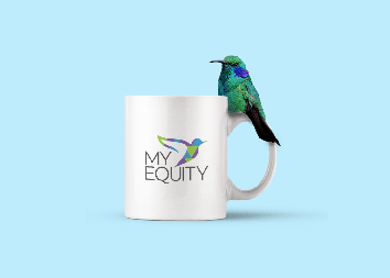
Overview: My Equity is a residential marketplace specializing in new-construction properties across the United States. I was tasked with creating a brand identity that would visually capture the company’s values and its role in helping clients build brighter futures.
The Brand: The foundation of the identity began with the My Equity logo. Designed to be clean, gentle, and modern, the logo established the typographic style and tone for the brand. While simple in appearance, it carries layered meaning—reflecting the complexities of homeownership and the care My Equity provides its clients. The hummingbird became the central symbol of the brand. Known for its constant motion and ability to gather essential resources for survival, the hummingbird represents resilience, adaptability, and forward movement. Much like these qualities, My Equity is dedicated to supporting clients as they take steps toward building their future.
The Connection
The hummingbird is more than a symbol—it reflects My Equity’s mission. Just as the bird tirelessly gathers resources, My Equity ensures that clients are cared for in every stage of their home purchase. To strengthen this connection, I designed the hummingbird with subtle geometric triangles that also resemble rooftops, visually tying the brand to housing and construction.
My Involvement:
Creative Director
Art Director
My Equity Website

Brand Guideline

")
related portfolio items